Sarasota film Festival ID and Logo
Design Animation Art Direction
Client: Sarasota Film Festival
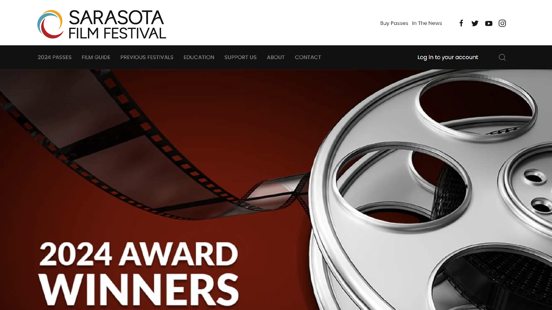
Main objective was to redesign the Sarasota Film Festival logo and develop an opening ident to play between films
Market Research
Sarasota Film Festival (SFF) was established in 1998 to provide an international film festival to the Suncoast, gathering filmmakers and community members together to celebrate the art of film. They’re also committed to year-round events around the Sarasota area, providing the community with cultural enrichment and education about filmmaking.
Audience & General Consumers of Final Deliverables:
Attendees of the week-long festival, along with filmmakers, students, local community members, and website visitors
Any potential recruiters or employers, as well as those interested in making connections for future freelance opportunities.
My initial thoughts about the brief:
Begin by designing with a focus on dynamism and a modern approach:
Update the typeface within the logo and word mark
Change the proportions and placement of the circular forms of the existing logo, applying negative space to create interest.
Once I had a logo produced that people positively responded to, I’d be able to use the new logos form to prepare for producing an ident, allowing the updated logo mark to inform the tone and motion of my animation.
Original Logo - Sourced from SFF WebsiteInitial Logo Adjustments
The original logo felt sterile and unbalanced, so I started my design process by adjusting the proportions and type to create a stronger base to begin my redesign. This was to create a better sense of stability and harmony in order to be more widely adaptable. Finding the small embellishments on the type inside the circles’ negative space to be outdated, I also adjusted their typeface in my starting point.
Taking inspiration from Japanese Kamon crests, I incorporated their circular forms shift towards wave-like elements, departing from the flat structure of the original logo. I felt this would add something unique to the form, representing both the emphasis on beach culture in the local area and the brand’s growth and inclusivity. At the same time, I wanted the logo mark to be recognizable to not confuse the viewer. Additionally, I wanted to keep the circular form in a more balanced way, which the Kamon achieved in some of their designs.
Kamon Crest Designs - Heian and Kamakura Period JapanLogo Redesign Process
Continuing to explore different variations in my design, I refined the wordmark hierarchy and logo structure to a dynamic wave design with more contemporary text. This added flair to the logo, making it modern through the implied movement. It energized the piece, associating the logo with innovation or progress.
After more variation, my art directors and I agreed the logo had even more potential for development. In the next iterations, I added negative space in the wave form to provide some more interest and designed a unique typeface to better match wordmark to logo.
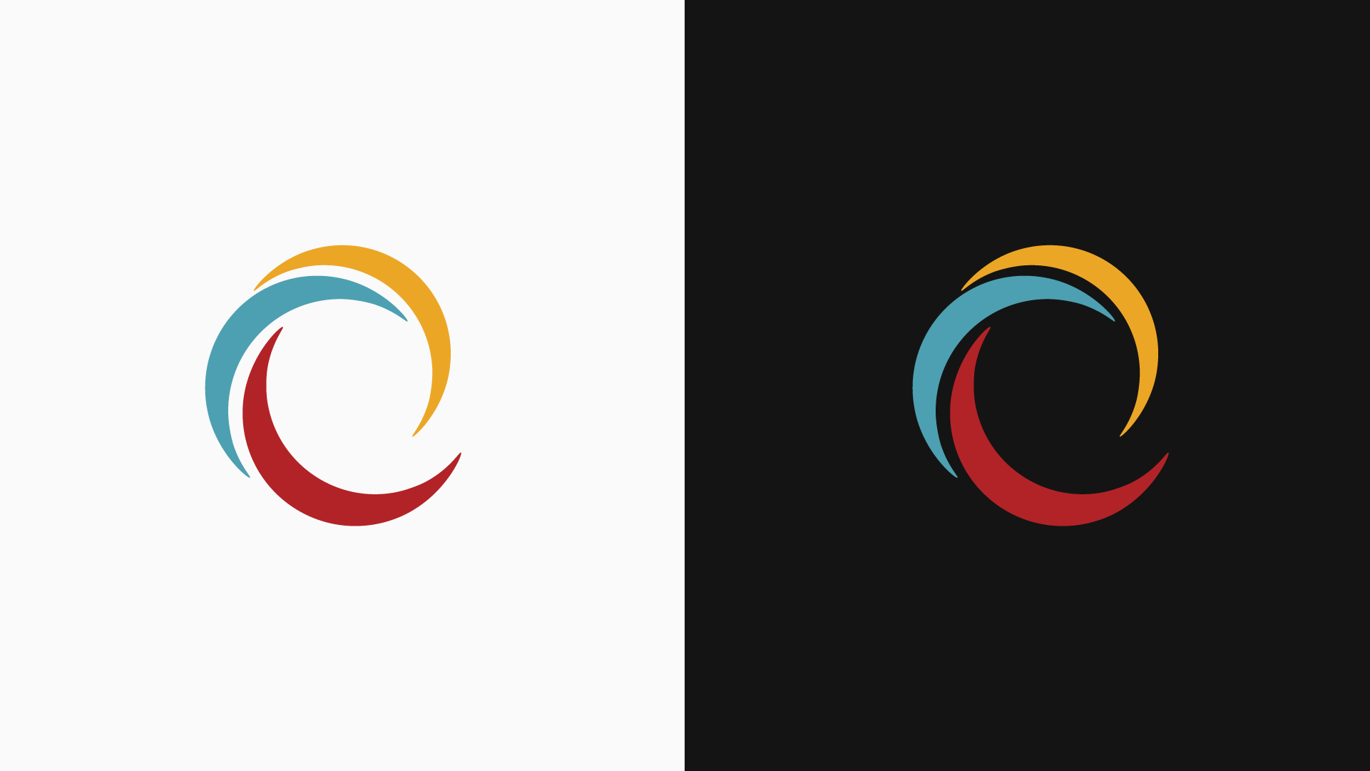
Final Logo ReDesign
Color and Font
Spacing circles and individual forms were extracted from original logo
Using the spacing from Sarasota Film Festival’s original logo, I refined the design, keeping the same colors and shapes but rearranging them into a dynamic wave that catches the viewer's eye.
By adjusting the color balance and proportions, the elements now stand out more clearly in a new order of importance.
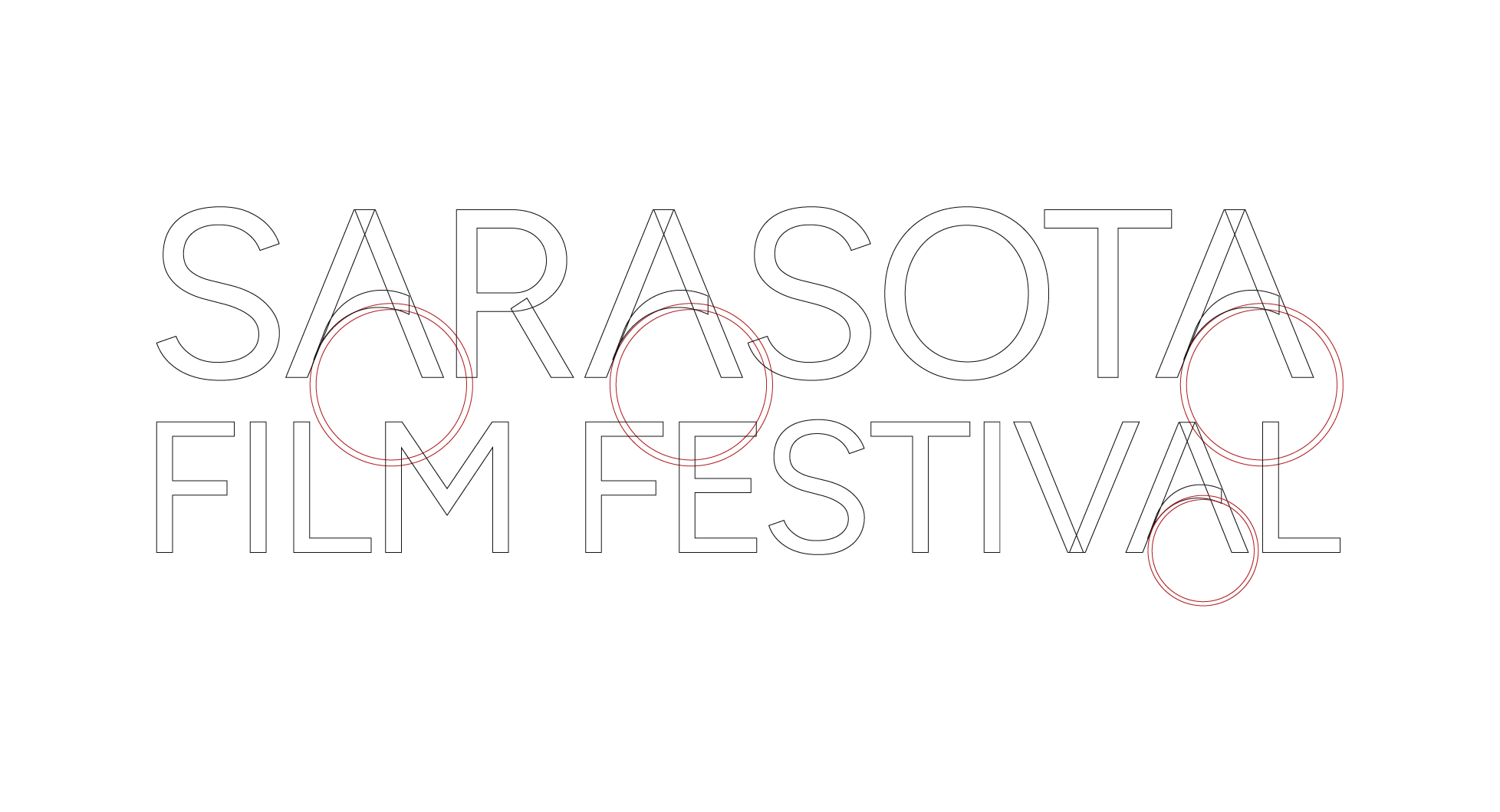
For the word mark, I updated the typeface to Figtree for a sleeker look and better readability for all festival attendees. This ensures the logo is easy to read across different mediums and for people of all ages.
To match the logo’s rounded form, I also rounded the A's crossbar in 'Sarasota’ using the circles I extracted, showing attention to detail, even in the smallest design elements.
Animation
The Concept
Vibrant light and color converge to form the Sarasota Film Festival logo, embodying the essence of filmmaking through luminous visuals and fluid motion.
