All In To Vote
Client: All In To Vote (Civic Nation)
Objective:
My goal was to create an animation that made people consider checking their nearest polling station while they were scrolling. This is a common fear among younger voters, so I wanted my call to action to encourage them to seek out information. I thought that was going to be most helpful and get the most interaction from viewers online.
The Research
All In To Vote was established in 2016 to promote democratic engagement on college campuses. The organization partners with Higher Ed Insight, theorizing that the structure, support, and recognition provided by All In will lead to increased democratic participation and foster a more inclusive democracy in the United States.
They utilize Post-Election Surveys and the National Study of Learning, Voting, and Engagement (NSLVE) to support their efforts with accredited data and comparative analysis.
My Audience
New eligible voters, ages 18-25, may not prioritize voting and need some engagement.
Any potential recruiters or employers, as well as those interested in making connections for future freelance opportunities.
My Approach
Begin by designing with a focus on voters' most common anxieties:
The intimidation of physically going to the polls
Uncertainty about where to find their designated polling locations
I strategically chose to capitalize on specific worries that often plague young and first-time voters. By addressing these fears head-on, the intent is to drive meaningful engagement by incorporating calls to action within the animation. This approach draws upon the comprehensive voting plans offered by All In to Vote, ultimately guiding voters towards a more confident and informed participation in the democratic process.
Initial Ideation
Immediately gravitating towards a distinctly graphic aesthetic, I took inspiration from various sources such as AP News and other Civic Nation resources. The first iteration of the designs, however, lacked refinement. Unsatisfied with my initial concepts, I continued to explore and evolve both my development process and stylistic approaches.
Direction 01: Write It In!
Focusing on the fear of going to the polls, this direction suggested the use of mail-in ballots, utilizing familiar language to convey that there’s no excuse for missing the opportunity to vote. Additionally, I aimed to establish a clearer hierarchy within the information, emphasizing the key elements of the call to action through my design.
Direction 02 : Map Quest
This design direction engages viewers with the familiar imagery of a map, encouraging them to locate their primary polling place within their neighborhood. It also strategically directs viewers to All In to Vote’s resources, offering assistance to ensure they are well-prepared for the voting process.
This pitch was chosen by art directors/professors when both directions were presented as two different conceptual ideas.
Development
As I imported the design into After Effects for animation, I refined the visuals by creating more consistent rounded shapes within the buildings and windows. I also eliminated the smaller text, as it was not essential to the overall message.
The result is essentially the same aesthetic and feel, but with a more polished appearance, allowing smoother animation and a more cohesive stylization.
Color and Font
I chose a fall-centric color palette to focus on the time of year, rather than use color associated with a political party. This also gives the animation better potential for reuse in the future.
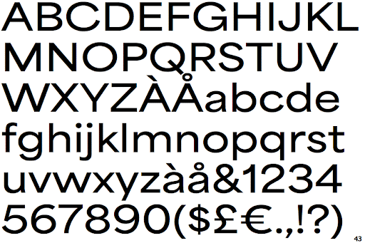
Area Extended also provided better readbility to the piece, with the addition of feeling modern using sans-serif.
Motion Test 01
My initial motion test focused on capturing the playful atmosphere of the piece, using a sample of jazz fusion to enhance the youthful tone I aimed to show. I also relied on vibrant colors and dynamic camera moves to grab the viewer's attention.
However, the text animation felt lacking, and the movement of the buildings as separate planes needed improvement. Additionally, there were several design inconsistencies, such as an unnecessary stroke around the text and tension throughout the lower part of the screen caused by the excessive number of windows.
In my next iteration, I aimed to address and correct these issues.
Final Animation
The typography proved to be the most challenging aspect to solve. Ultimately, I decided to align the text animation with the 'pop' movement found throughout the rest of the piece. Once I made that decision, adjusting the timing and overall movement became much easier, and I was pleased with how the energy seamlessly flowed into the entire loop.


