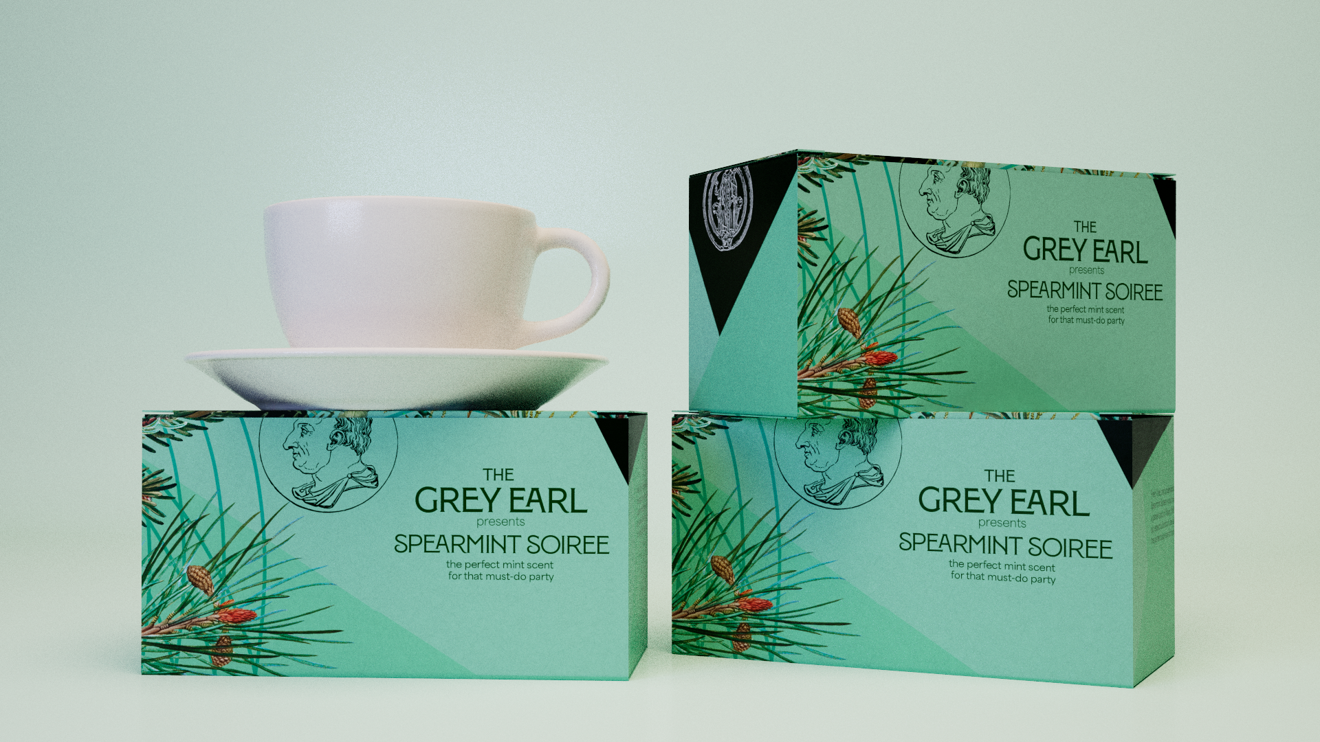
The Grey Earl Branding & ID
Client: Self-Directed Project
Objective:
An evolving brand identity project rooted in an initial asset-building exercise, now developed into an ongoing passion project focused on exploring diverse branding strategies and copywriting concepts for a cohesive tea brand
Design
Capturing an Aesthetic
I began by developing the main logo, as I felt this was what would separate the brand from other tea brands I’d researched.
Product Design
The Individual Boxes
For the product design, I maintained a straightforward box structure in my 3D rendering program, focusing on highlighting the florals, the tea's color palette, and ensuring the logo remained clear and legible for strong brand recognition.
I also aimed for the boxes to feel versatile, allowing them to seamlessly integrate into other projects—whether as background elements or reusable assets—while still retaining visual interest and brand identity.
What began as a design exercise has evolved into a passion project—something I return to whenever inspiration strikes or when I feel compelled to experiment with new ideas, practice techniques, and push the boundaries of branding and copywriting
Advertising in Motion
For sample social media advertising, I created a looping Rube Goldberg Machine featuring the product.
I also created a mock commercial spot, highlighting the different flavors and cheeky tone of the brand. This was a test render produced for brand tone and look development of the initial packaging.


